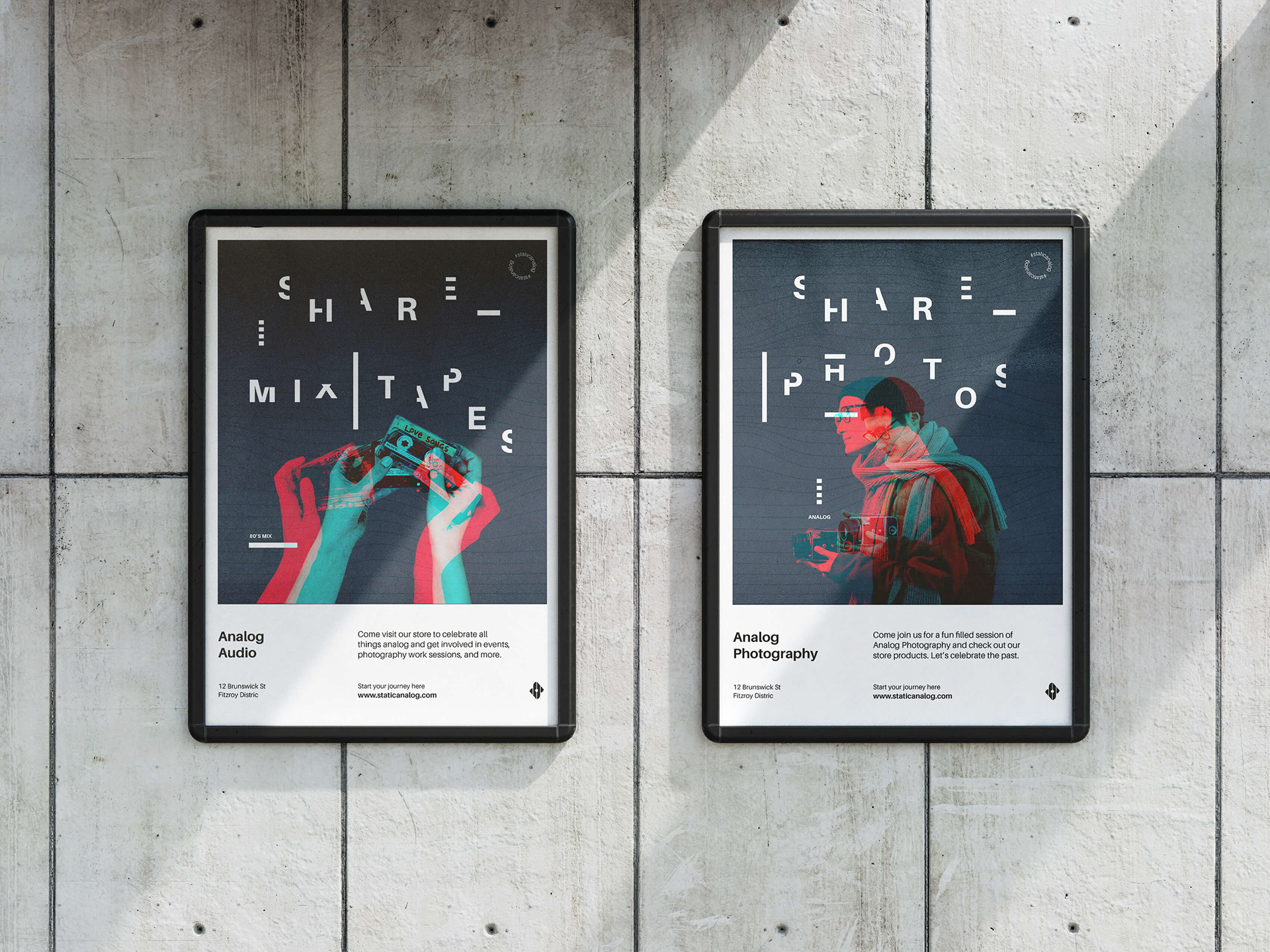
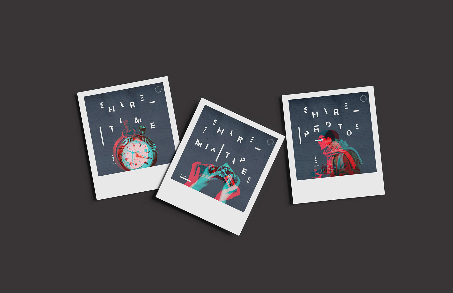
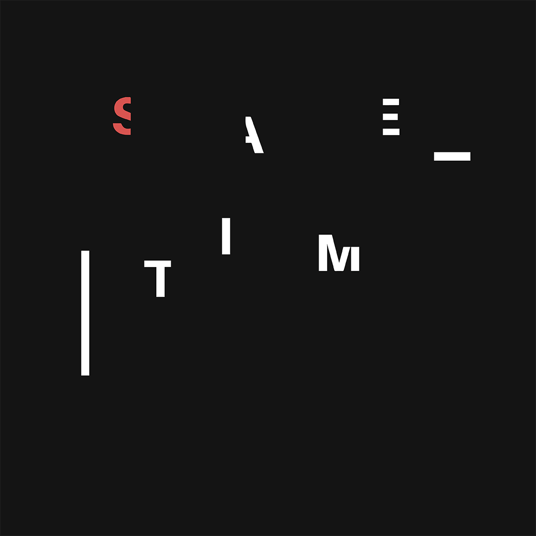
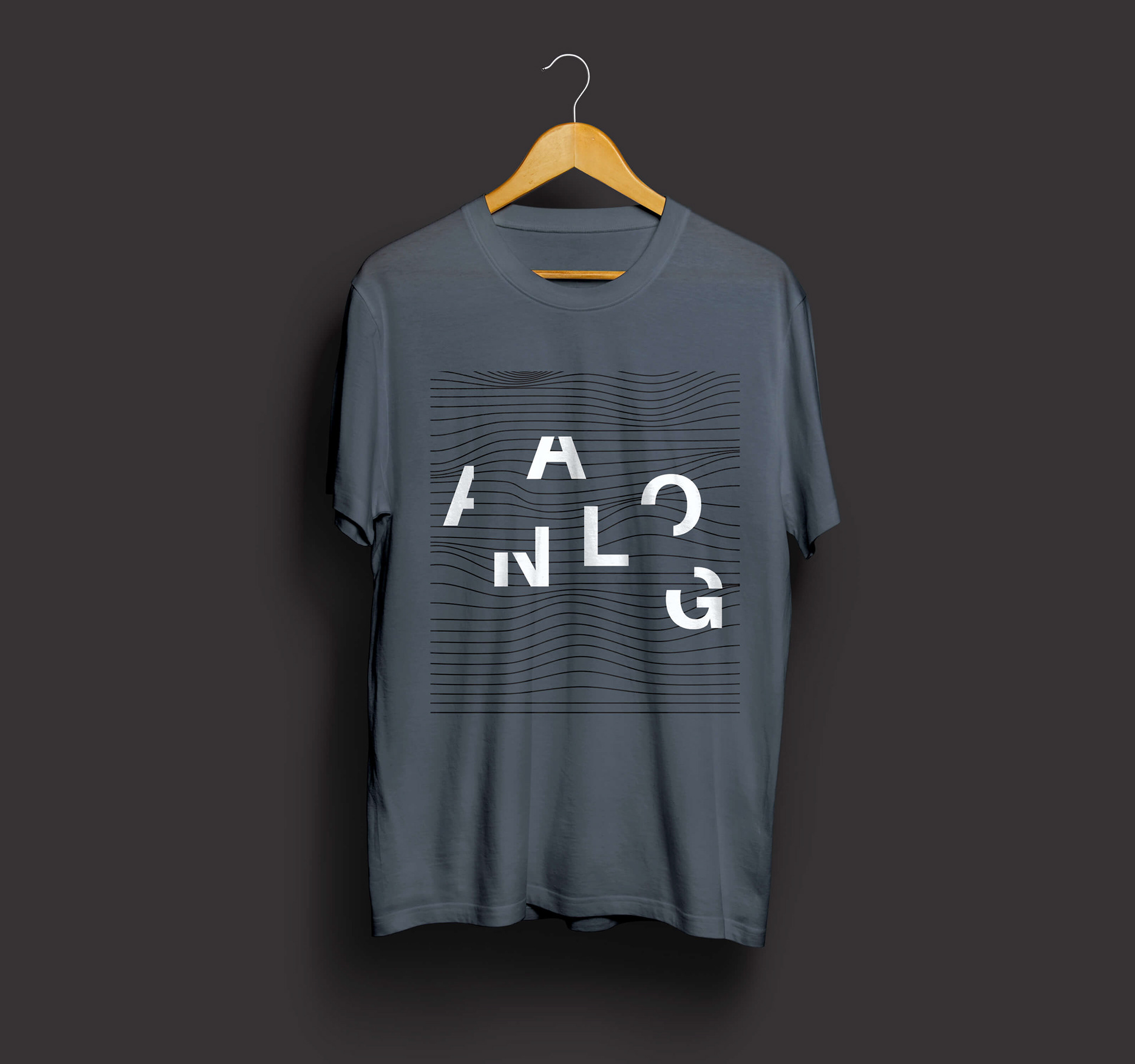
A fresh Identity for a conceptual startup business that focuses on celebrating all things analog via a store. Based on the concept of “Finding time to slow down”, the modern type and disconnected letters represent detachment while the double exposure effect reminds audience of developing photos in a dark room. A perfect place for those that require a more tactile experience.
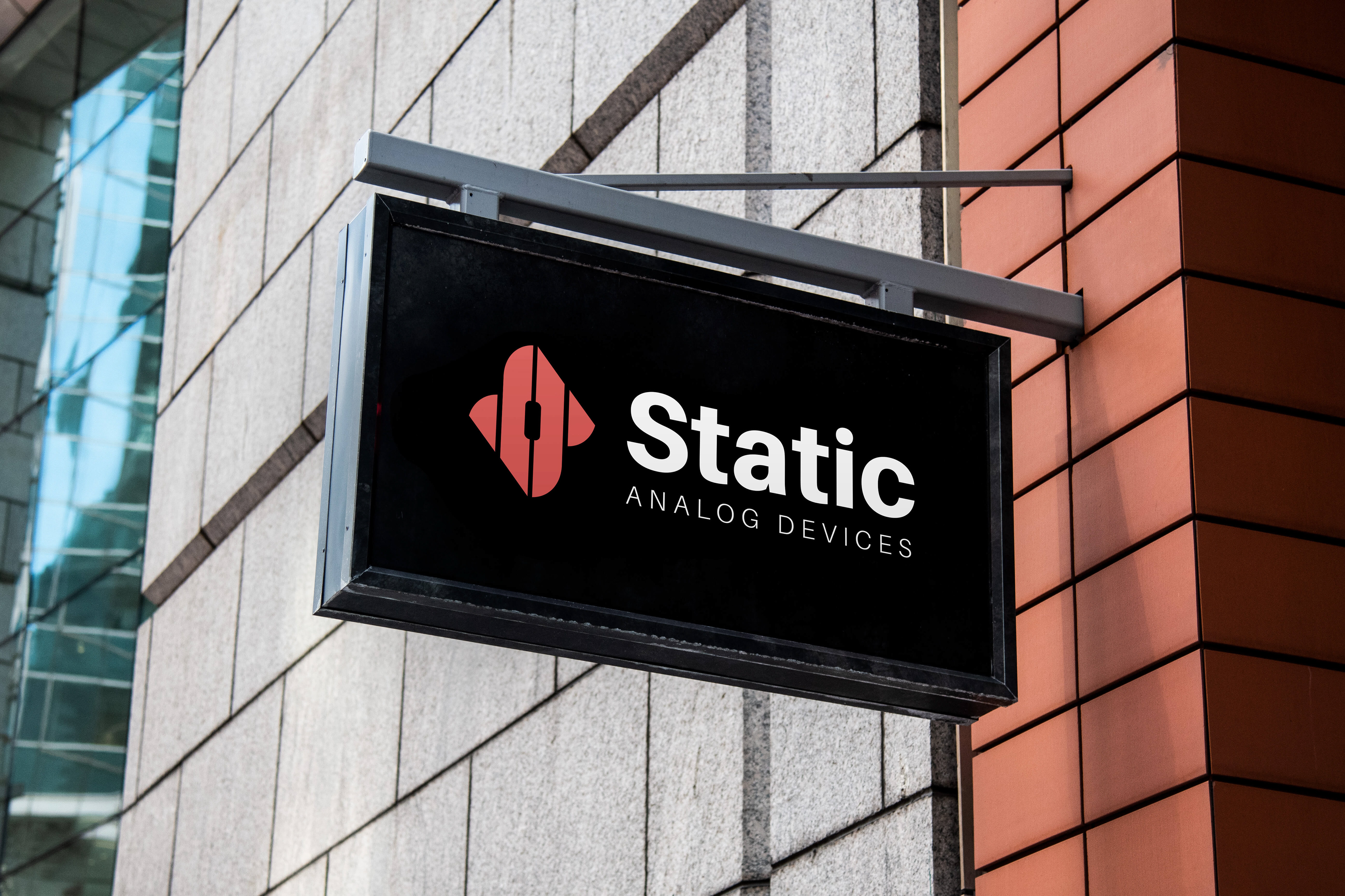
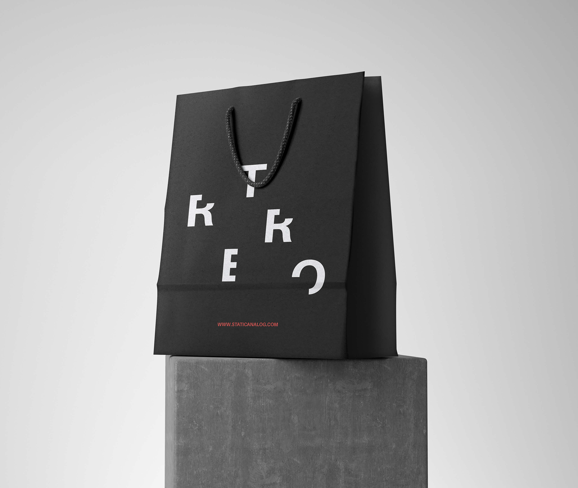
LOGO DESIGN | BRAND IDENTITy